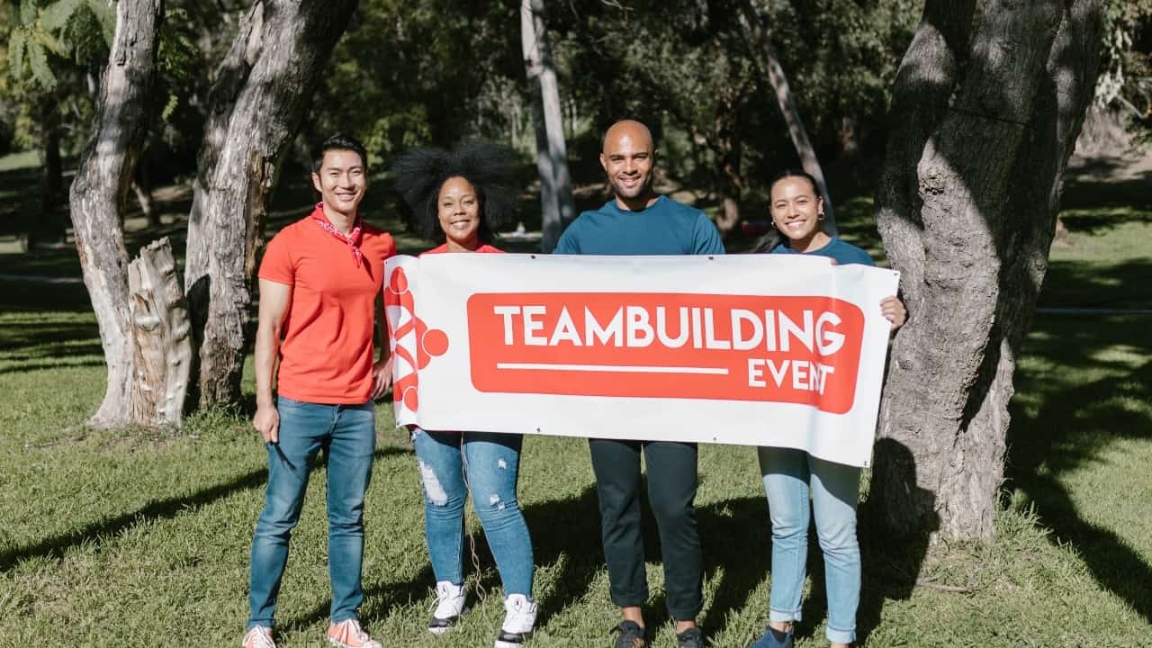
Banners are a terrific method to get your message over to your target audience quickly. However, you must devote time and effort to the design process in order to proudly hoist your event banner for all to see.
Purpose
Before you begin using any design tools, you must first decide what you want to achieve. Everything about your event banner, from the fonts you pick to the arrangement, will be determined by the message you wish to deliver.
Do you want to utilise the banner to promote your company? Do you wish to advertise a certain product or service?
Make a list of the important information you want to include on your banner. It should usually include a call to action, a marketing promise, and some basic information about your company.
Messaging
Keep the amount of copy to a bare minimum. Less is more in this case. You don’t want to use a jumbled banner because it isn’t normally intended for a captive audience.
You can see how Apple did it by looking at their copy. To make their copy easy to read, Apple uses short, broken-up sentences.
You only need one solid line to make your argument. After reading your headline, what do you want event goers to remember?
Your banners should also include a call to action (CTA). Listed below are a few examples:
- Sign up right now!
- Please go to our website!
- Please contact us right away!
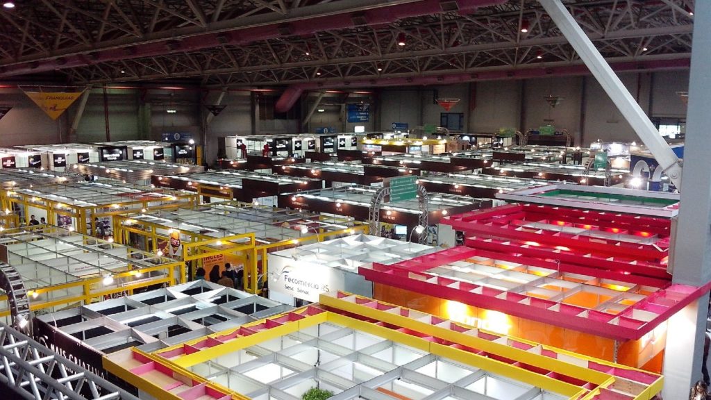
Location
The design of your banner will also be determined by the location where it will be displayed. There’s no need to give a business address if your event is taking place at your organisation, for example. You may make better use of the extra space by repurposing it.
When it comes to outdoor events, PVC banners are usually the finest option. There’s no need to be concerned about the colour fading in direct sunshine. PVC banners are a terrific option if you plan on attending a lot of trade exhibitions because they are quite durable.
For windy summer events, flag banners can be a terrific choice. Mesh banners, on the other hand, may be the finest option in highly windy areas.
Check out our Valentine’s Day Digital Marketing Ideas as well.
Dimensions and Format
After you’ve decided on a place, you can start looking at several sizes and formats:
- Setup: If you’re going to utilise flags or hanging banners that are meant to be raised high above the ground, be sure they’re visible. This can be accomplished by utilising large, easily readable typefaces.
Because exhibition stands and pull-up banners are frequently at eye level, you have more typographic alternatives. People are more likely to stop and read such posters, allowing you to employ more text.
- Size: Sizes range from 2’x3′ to 10’x16′ in most cases. The size you’ll need is determined by how close your audience will be to the banner.
The larger the banner you require, the greater the distance. Keep in mind that at a wider distance, ornate borders and other fine design details will be lost.
- Orientation: Arranging the copy horizontally is the most natural alternative. Because most people like to read from left to right, it is easier on the eyes this way.
It’s advisable to leave more space between each line of text and use fewer words if you wish to arrange the text vertically. This way, you’ll be able to offer extra clarity.
Fonts
This stage necessitates serious thought. If you use improper fonts, your message can easily be overlooked. Use a font with bold, thick lines to make the text more readable from a distance.
When it comes to outdoor banners, sans serif fonts are the finest option. If you’re going to utilise all-caps, leave some space between letters. If your wordmark or company name isn’t the headline, you have more leeway with stylistic fonts and scripts.
Use Correct Image Files
You can supply your own artwork to most commercial printers. You must, however, use high-resolution graphics.
When resizing the graphics, this will prevent strange discolouration and pixelation. If you wish to avoid most image errors, it is best to use vector files.
Images & Colours
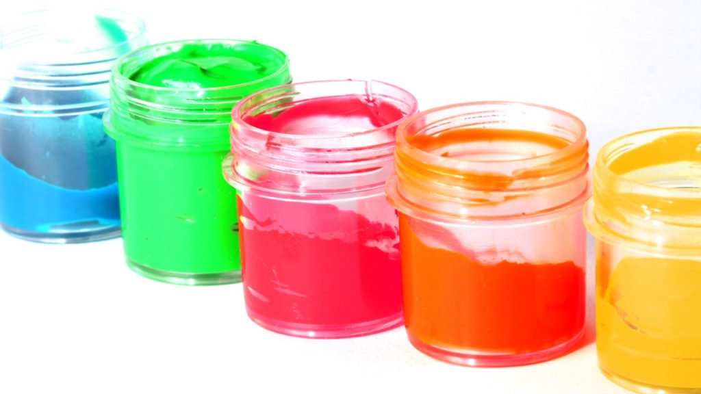
Colour psychology is crucial when it comes to banner design. Colours that contrast and complement each other are preferable in general. If you wish to use detailed colour graphics, a neutral or white background is a suitable choice.
Use semi-transparent graphics on a coloured background to maintain the focus on the text. Keep the focus on the colours if your main goal is to increase brand familiarity and visibility.
In summary, the role of custom banners in business marketing is a crucial one – follow the advice provided above and you’ll boost your brand’s visibility in no time.
Check out these questions to ask before starting a business as well.